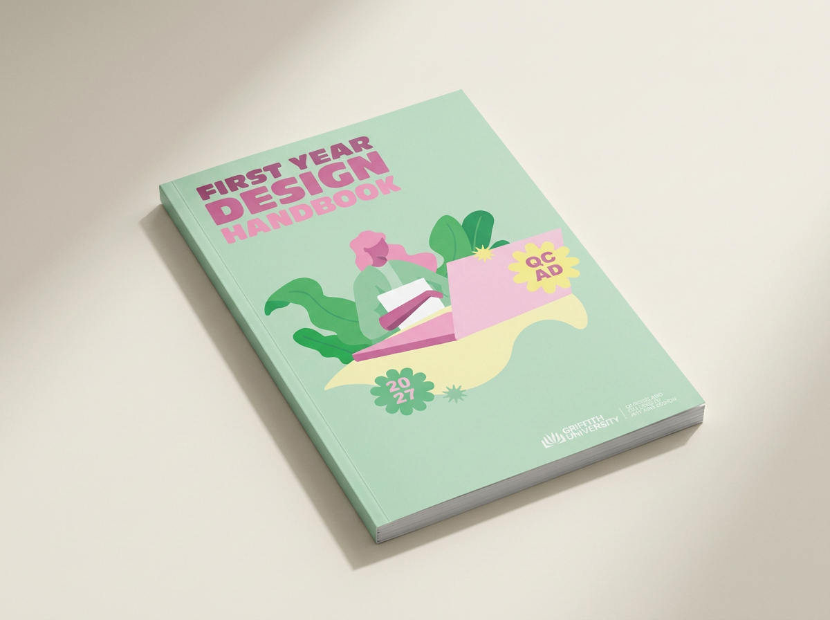
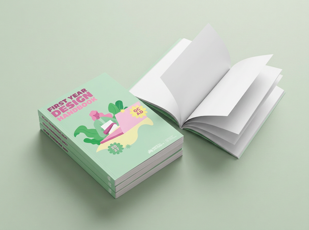
The First Year Design Handbook project was developed through Liveworm at Queensland College of Art and Design (QCAD), with the brief focused on creating a cover concept for students beginning their studies at Griffith University’s Queensland College of Art and Design. The project provided an opportunity to consider how visual communication can shape a student’s first impression of their new creative environment, with the cover needing to feel welcoming, engaging and relevant to a young audience entering the design field. Rather than creating a purely informative publication cover, the concept aimed to reflect the energy, creativity and sense of possibility associated with beginning a design degree.
The design process focused on identifying visual elements that could communicate the personality of QCAD while appealing to first-year students from a range of creative disciplines. Typography, illustration, colour and graphic composition were explored as key components of the visual direction, with the aim of developing a cover that felt youthful and expressive without becoming visually overwhelming. Custom illustration and playful graphic elements were incorporated to introduce a sense of personality, while bold typography helped establish a strong visual hierarchy and ensured the title remained clear and recognisable.
The final design combines a bright colour palette, bold typography, custom illustration and playful graphic elements to create a cohesive and approachable visual identity for the handbook. Each element was considered in relation to the intended student audience, helping the publication feel less formal and institutional while still functioning as a clear and recognisable resource. The visual language was designed to capture the excitement of entering a new creative environment and encourage students to engage with the handbook as part of their introduction to university life and design study.
The final outcome is a vibrant and engaging cover concept that balances communication with personality. The First Year Design Handbook demonstrates how illustration, typography and colour can work together to create an identity that is both functional and expressive, while responding to the expectations and interests of a specific audience. Ultimately, the project explores how thoughtful visual design can make an educational resource feel more approachable, memorable and connected to the creative community it represents.